I'm the kind of person who likes to look behind the curtain and see how things are made. I've been known to buy a DVD just for the bonus features. So I thought I'd share a little of the process for my latest creation,
Wandering Koala uncovers the Sixth Figure, a comic scheduled for release in March.
The idea for this story came to me when I was reading a biography of H.J. Ward, one of my favorite artists. He painted covers for pulp magazines during the 30s and 40s before he died from smoking (stupid people depriving us of so much art). I purchased the biography quite a while ago but never got around to reading it until just recently. It mentioned how putting women in terror on the cover sold more copies regardless of what was actually in the magazine. So I thought I'd create an image of Wandering Koala in peril.
I drew a thumbnail and started to lay it out, but never finished. But what I did do was create a story around the cover. I was so intrigued by the imagery I couldn't help myself.
I write all stories by first jotting down ideas in pen in a tablet. Once I have enough ideas I start to shape a story, then jot down more ideas, sometimes sketching images. When I finally see a story start to emerge, I create a tight plot with dialogue. The process diverges from there.
For this comic, I analyzed a lot of past work, what worked, what didn't work, what I liked, what I wish had turned out better, and what I enjoy doing. I then created a few concept illustrations (which I
posted previously) until I found a style I liked.
I also asked myself what kind of writing I like. I like a narrator who is involved with the story. So I wrote this story from the point of view of Brent who usually accompanies the Wandering Koala. It also meant I didn't need much dialogue, which was good because I hate word balloons. I have no intention of using them in this comic. I do like boxes with narration--they make nice design elements. I also chose a font that looked sort of handwritten but was really easy to read.
I typed the story up in a Pages document to see how long the story was and to revise it easily until I was satisfied with it. Also, I can just cut and paste the text, so the lettering is half finished. Nice bonus.
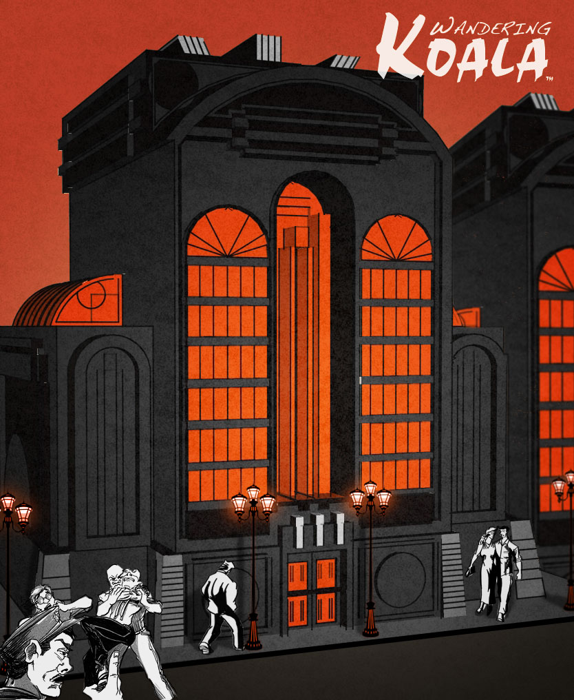
The backgrounds were created in Google SketchUp like
The Phantom Coach had been, but this time I went for a more detailed deco look with thinner lines and some texture. I, of course, do some noodling in Corel Painter X to make them look more hand drawn and wood carved.
The figures were originally going to be black, white, red-orange, but I happened to try a full color figure in one of the concept illustrations and really liked it. So for the first page I tried two versions, and ended up liking the full version better. But to keep a limited palette, I'm only using Red thru Yellow; no Green, Blue, or Purple (except for one place where I cheat). I'm also using a lot of silhouettes and panels with no frame, because I really like the look, and it provides a nice change as does the occasional backgroundless panel.
I'm really liking the look. And the look was very important to me, because comics have to compete with video games, which means they need to be visually stunning.
So far I am seven pages into the tale. It's scheduled to be released in March, so I've still got a long way to go. The final comic will be around 40 pages long.
I hope you like the final result!


 Part 3 of Wandering Koala meets the Beast who came for Christmas is finally available! Here is the cover with a gorgeous image of Alpine Fall's local church.
 The latest chapter in the Wandering Koala saga is now available!


 Has anyone ever told you to stay out of an argument because it doesn’t involve you? Do private disputes really stay private, or do they have a larger effect on the world around them? What if a domestic disturbance caused a ghostly disturbance? Mike and Angie are just another couple on just another Friday Night date having just another argument. But this time it won’t stay between them.
 So I've begun a new comic. But it's not really that new. This is the third time I've tried writing/drawing this story, but I think this time it will work.