Showing posts with label Painter X. Show all posts

Wednesday, November 14, 2012

Digital Painting the Corel Painter way


It's no secret I love Pulp Art (Doc Savage, The Spider, The Bat, and more) and Boys Adventure Stories (Hardy Boys, Tom Swift, and more). I love the painted covers. I love the black and white pen & ink illustrations inside.

I've always wanted to create books like those. And a few years ago I published my first one. Pick it up if you haven't already. Links to Paperback and eBook versions are at www.WanderingKoala.com. I wrote the boys adventure type story (but for an older, more sophisticated audience), I drew the black and white pen & ink (and brushwork) illustrations for the interiors, and I painted a cover.

Ok, that last part I didn't do--not really.

I tried. I really did. But I just can't paint. So I did the best I could, and it turned out well, but.... I figured I would never have painted covers unless I hired someone to do them, and I really didn't want to do that. It was bad enough hiring an editor for my second novel. He did a great job and gave me numerous insights that have helped my writing tremendously, but I still want my work to be MY work--100% Jeff.

Then the other day I was watching several courses from Lynda.com (great site to learn to use graphics programs--get a subscription if you don't already). I discovered some really cool and amazing things that Corel Painter can do--things I had no idea I had software for. So I put the lessons to use.

Above is my latest work. It took several tries to get it right, but I think it turned out well. It looks like the background from Tarzan. I'm definitely going to try this technique to have a truly painted cover for my next work, The Green Bull (a Wandering Koala tale), and not just a wannabe painted cover.

I can't wait!


Monday, August 27, 2012

Style


Style is an interesting thing. It's something unique to each person. Some style has style while others don't. It's something that is developed, yet it almost happens subconsciously--someone can't sit down and say, "I'm going to create a style and it'll be like this."

So how does one go about developing a style? It's a time consuming process, and some would argue one that never has an ending. But there are a couple of things one can do to speed up the process. And they all involve a sketchbook.

First, every time you see something that inspires you or catches your eye, emulate it in your sketchbook. Emulate--don't slavishly copy. Create something original using the aspects that caught your eye.

Second, go thru your previous sketches and artwork. Look for things you tend to do well, things you do poorly, things you like, and things you don't like. Make a conscious decision on what you will continue to do, what you will stop doing, and what you need to improve. Then do it. In your sketchbook.

You'll still spend a great deal of time developing your style, but these exercises will focus your effort and speed up the process.

So what does this have to do with the above image? I've been working towards a certain type of style, and with this illustration, I think I've reached it.

What do you think?

Friday, August 17, 2012

Should Digital Art Look Digital?


I've always thought that art materials should be true to themselves. What I mean is a watercolor should look like a watercolor, and an oil painting should look like an oil painting. Just because you can make watercolors look like oils doesn't mean you should. Each material has unique properties that allow you to do things you can't in other mediums as well as certain restrictions you have to work around. It's part of what gives artwork its charm.

But that brings up a bit of a problem when it comes to digital art. The computer has a unique look to its graphics, but it can also do an amazing job of emulating traditional art (thanks to Corel Painter!). So should the same rules apply to digital art as traditional art?

On the one side I'm inclined to say yes. The computer has introduced a whole set of new "looks" that hadn't been done before. But then I look at these (like vector illustrations and flash animation) and I'm taken back aghast at how ugly they can be. Too sterile, too mechanical, too generic.

So that flips me to the other side where I see the computer can emulate the natural media without the messy cleanup or the expensive art supply bill (of course, it's not like computers and graphic software are cheap, so that's probably a wash).

This has led me to experiment a lot with style. I tend to not like my work that is too "computery" so I've been trying to get a look that is closer and closer to natural media. But there's no reason I can't throw in a few digital flairs here and there. And maybe that is the answer. Maybe a mostly traditional route with digital flourishes is the unique look.

Take a look at my latest sketch and let me know.

Thursday, July 26, 2012

Play Ball!!! a Cully Koala cartoon short

For decades I've wanted to create a Cully Koala animated cartoon. The  I never thought I'd be able to because of technical limitations. But technology has exploded, and anyone can create beautiful animation  (they just need to know how).
Cully was originally conceived as an animated character. I used to watch and love Peanuts and Garfield cartoons. I thought they were animated cartoon characters; I didn't realize they started out in comic strips in the newspapers. When I created Cully, I wanted him to be like a Mickey Mouse, Snoopy, Garfield, etc. I didn't have anyway to animate him, so I followed the examples of Charles Schultz and Jim Davis and created a comic strip. Once I discovered Calvin & Hobbes, Cully took on a whole new dimension. But I still wasn't completely satisfied.
Then I discovered Richie Rich and Archie comics, and created a Cully comic book of my own. The characters worked much better in the longer format. I thought maybe comic books would be a doable outlet. But it lacked something.
A few years ago I took a graduate class in animation and discovered a way to animate with Apple's iLife. I created a really cool short, but it was so much work that I knew that route wasn't viable. There had to be a way to let technology do the grunt work while I concentrated on the creative side.
Enter Anime Studio Pro. I've been considering this program for a while, and even downloaded the demo to try it out, but I'd never had the results I wanted. I was about to give up and go back to drawing cartoons by hand, but I said to myself, "Self, you've got to push thru. You've got ideas, and this program can make them happen."
And it did.
Let me know what you think!

Monday, July 23, 2012

Character Sketch: Princess Ballroom

You've probably noticed I've been pretty quiet on this blog. Why, you ask? I've been working on an animation project. It should be finished soon. until then, enjoy my latest character sketch:


This was inspired by Princess Knight by the great Osamu Tezuka, a graphic novel that was recently released in English and I just finished reading. The story itself was kind of a mess, but the drawings were really nice. The style was more early-Tezuka then late-Tezuka. There was a strong influence from Disney cartoons.

This was drawn in Corel Painter X with the background rendered in Adobe Photoshop with Painter texture drawn on top. Overall it turned out well, but I don't think it's a style I will keep exploring.

Stay tuned for the upcoming animation. Here is a sneak peek:

Saturday, June 23, 2012

Character Sketch: A Real Cowboy


So I'm back to character sketches and character designs. This time I turn to the West for a cowboy.

I drew this in Corel Painter X. I'm really starting to enjoy the look of digital inks. As I mentioned in a previous post, digital art should look like digital art and not traditional, and this is another step towards creating a unique look for my work.

I created two versions to test coloring styles. For the first I used my typical painting style in Painter from the half page comic days. For the second I used a new style with Photoshop shadows. I thought the second version would looks better, but I think I like the first.

I think the background turned out exceptionally well. The figure I'm not as happy with. It's good, but not great. He feels a little stiff.

But let me hear what you think.

Friday, June 15, 2012

Digital Painting - New Tool or New Medium?


This may surprise a few people, but there was a time before computers existed. No really, there was. Back then artists created work with paint, watercolors, ink, charcoal, and other physical mediums, not Photoshop or Wacom tablets. Once computers were invented, it didn't take long for computer graphics to rear their pretty heads. At first they were pretty primitive and had a distinct look. (Check out The Last Starfighter to see what I'm talking about.) By the 90s, computers were powerful enough to create work that looked like it had been made by hand. That lead many to ask whether computers were merely a new tool to create work that looked like traditional art, or whether computers were a new medium with it's own look and characteristics.

They were both right.

Many people use computers to mimic traditional art methods. But not me. I've said many times that a watercolor should look like a watercolor, and an oil painting should look like an oil painting. While you can create photorealistic oil paintings or rich watercolors that look like oil, one has to ask why. Each medium has really cool and unique properties, and the artist should take advantage of them. And that doesn't apply strictly to visual art either. Movie adaptions of books should take advantage of cinema and not try to follow a book to closely, as should book adaptions of movies.

I've been working with a number of computer programs including Adobe Photoshop, Corel Painter (which does an amazing job of emulating natural media), Google Sketch Up, and others. I've been trying to create a style that looks digital, but not cheesy-we're-still-stuck-in-the-90s digital. The drawing above is my latest attempt. It has all the hallmarks of a traditionally drawn and painted work, but there's no question it's digital. I'm happy with how it turned out. I think an illustrated eBook with this type of art would be pretty cool, especially on a tablet. Maybe for my next project...

Wednesday, April 25, 2012

Color Illustration: Chained and Doomed


I'm not sure why I felt like drawing a six-armed beast with a blade in each hand ready to slice a chained Wandering Koala, but I did. Chains look really cool, have great texture, and take forever to draw. I really like how there are only two colors on the beast, and yet he looks like he's in full color. I also beat up the Wandering Koala more than usual with cuts, bruises, and torn clothes. Usually he escapes untouched, but that can get boring after a while.

I drew this with a Staedtler 2B pencil, inked it with a brush and sumi ink, and colored it in Adobe Photoshop and Corel Painter. I used a more painterly style, because this was a fantasy illustration and fantasy looks best in surreal paints.

Let me know what you think!

Thursday, April 19, 2012

Wandering Koala meets The Heckler


The Heckler was a great comic from the 90s created by Keith Giffen that ended way too soon along with Justice Society of America and Green Lantern: Mosaic. It was clever, witty, and made fun of so many conventions. I wonder, why didn't DC bring it back with its New 52? I really enjoyed The Heckler and wanted to see more of his adventures.


So I drew one.


I used a painting texture style that I developed while illustrating a children's storybook a couple of years ago. I really liked the effect and thought it would suit this work. The line work was created with some funky Zebra disposable pen brushes I purchased at JetPens. I included the black & white version below. It works really well in black & white, something I always try to do. Not only do I end up with two illustrations, but if an illustration works in black & white, then it seems to work better in color.


As always, let me know what you think.
________________
Follow Jeff on

Thursday, March 1, 2012

It all began with an image...

It all started one night while I was reading a biography of H.J. Ward, one of my favorite artists. He painted covers for pulp magazines during the 30s and 40s before he killed himself with tobacco from smoking (bad habits hurt everyone). I purchased the biography quite a while ago but never got around to reading it until a couple of months ago. It mentioned how putting women in terror on the cover sold more copies regardless of what was actually in the magazine. It reminded me of early Wonder Woman comics which featured bondage in nearly half of all the panels, and which were as popular as Superman and Batman in the day.


Does bondage, torture, pain, peril, and the like really sell? An image of Wandering Koala being chained up and tortured came to mind. I thought it'd make a great cover.


I drew a thumbnail and started to lay it out, but never finished. But what I did do was create a story around the cover. I was so intrigued by the imagery I couldn't help myself. Until I had drawn half the comic. By that time I realized I needed a different cover image to accurately reflect the tone. But I thought it would make a nice interior full page panel. And it did.


I drew it with a Papermate Sharpwriter pencil, inked it with a crow quill pen, then colored it in Adobe Photoshop and used Corel Painter X and Google SketchUp for the background.


The comic is available at Smashwords and Amazon.com. A 12-page preview is available online.


Friday, January 20, 2012

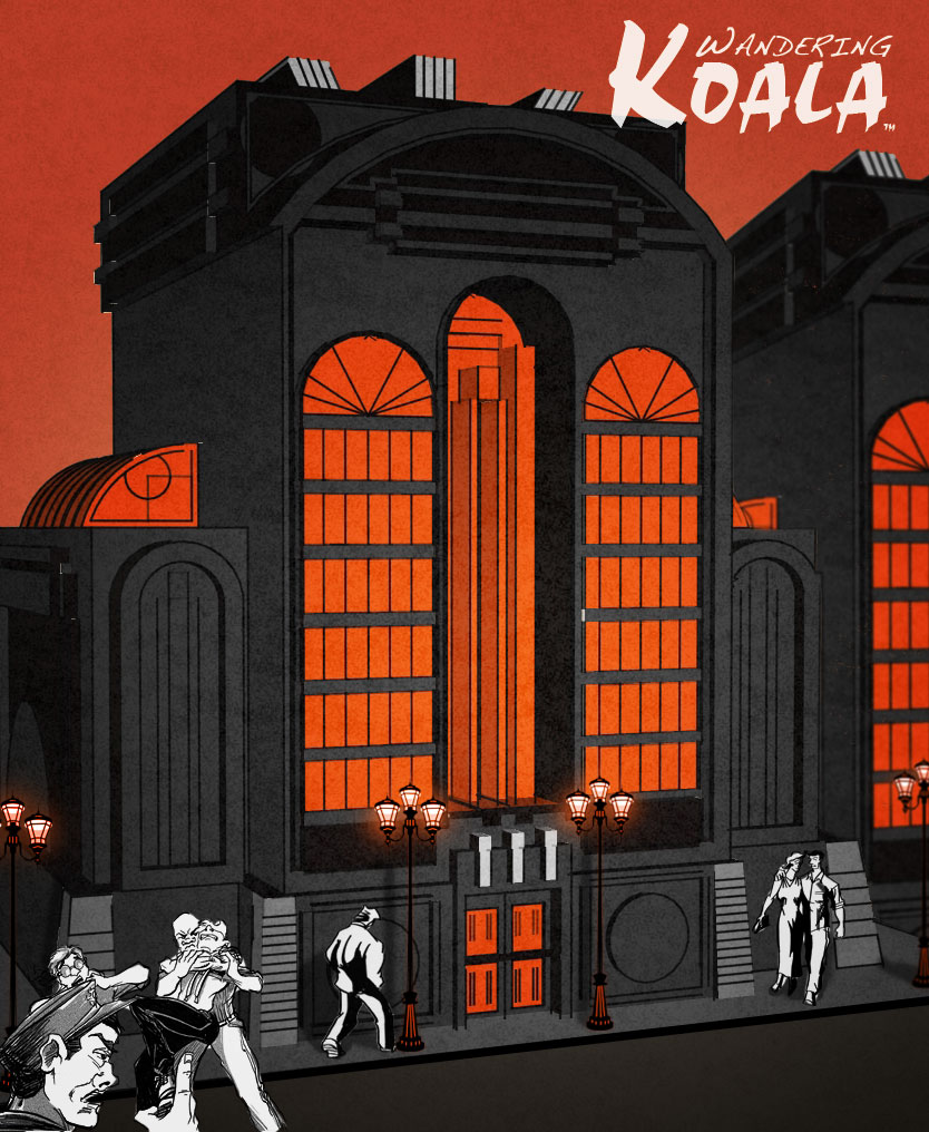
Concept Sketch: Striking at Night

 It's always good from time to time to go back over one's life or one's work and reflect on where one has been and where one should go.

I've been working on a new comic book, and I've spent a lot of time contemplating what style I should render it in. I've spent a lot of time looking over my past work analyzing it for what  and worked and what didn't work so well.
After much reflection and thought, I've come up with the two illustrations at the left. They strongly resemble the style I used for Wandering Koala rides the Phantom Coach. I always really liked the style, but felt it was too harsh and didn't have enough life and character to it. So I've incorporated elements from my Raw Umber style.  I love it, but it can be a little boring to look at a series of images in it.

I am really happy with this look. It fits the story I've written. It's not too harsh or boring, two faults of previous styles, and the drawing is much stronger with cleaner lines and better structure.

The buildings in the background were created in Google SketchUp. The people will be drawn by hand with Staedtler 2B pencils and inked with a Zebra brush pen from Japan. The coloring was done in Adobe Photoshop and Corel Painter X.

I'm still working on how to letter it. And I'm not sure if I want to use dialogue balloons--they tend to look very cartoony. I want a more serious tone and mood.

But I'd love to hear what you have to say. Do you like it? Do you have any suggestions?

Monday, January 9, 2012

Character Sketch: Wiseguy

It's kind of strange how people embrace the bad guy and his bad ways. You hear about girls going for the "bad boy" and many people cheering for the "villain" of a movie or book--although I have to admit Darth Vader was pretty cool.

Even today you see a lot of people calling socially destructive behavior like homosexuality good, and branding those that try and defend society, freedom, and the necessary principles for their survival as "bad" "closed-minded" "ignorant" "bigot" and other labels that couldn't be further from the truth.

What is it about evil that is so seductive? What is it about good that is so repelling? And why are people so easily confused about which is which?

Here is a digital illustration of a wiseguy displayed as a card. A wiseguy is part of organized crime and should be considered a bad guy, yet there are many out there who would look up to him and even want to be him.

I created the illustration in Corel Painter X and Adobe Photoshop CS. I really like the design, although a different style might have worked better. The colors are nice.

Wednesday, December 21, 2011

Character Sketch: Chef in Color

And here is the chef in color. I still can't tell you about the top secret project, but I can tell you he was colored in Corel Painter X, one of my favorite programs. I used the Digital Watercolor brush, and I think he turned out really well.

Friday, September 23, 2011

Character Sketch: Archeology Professor

One of my favorite things about writing stories is creating new characters and new worlds. In my latest I needed an archeology professor, so I created Professor Kissinger. She's not a very nice lady, as you can see from the picture.

The name came from one of my many debate coaches in high school. Originally I was going to make her skinny and angular, but after looking thru a lot of images of women, I decided to go the other direction. I love the frog-like look of her face. The way her eyes slant down and her mouth puckers tightly with the checks and mouth wide remind me of Chuck Jones' version of the grinch. And I think she is very distinct.

I drew her with a Staedtler 2B pencil, inked her with a Zig calligraphy pen, and colored her in Corel Painter X, still the best version of the software.

So what is the name of the project she's from? I'll give you a hint: it's a new format I'm experimenting with, a hybrid of a graphic novel and an illustrated novel.

I'll give you another hint: it's called The Caveman Conspiracy. I hope to have it out in a month or so. I've finished several pages of it, but have many more to go.

Monday, September 12, 2011

Character Sketches: A Boxer Contemplating

So I've been sketching again, and this time I did something I hadn't done before. It's funny, I hate boxing, and I hate watching it, but I do enjoy movies about it and art about it. I'm not sure why.

This was drawn with a Staedtler 2B pencil, inked with a Zig calligraphy pen, and colored in Corel Painter X. I was really pleased with how it turned out. The words are because I'm testing out a font and a style for my next graphic novel which should be out in a month or so.

Let me know what you think!

Monday, April 11, 2011

A few thoughts on books and writing

So a friend and fellow author has a blog where where she does a lot of reflecting on the writing process, publishing, and other related topics. Her latest post made many points and raised many questions that I've often pondered. Here are a few of my responses to what she wrote.

1) So called "literature" is in not superior to so called "escapist fantasy" books. I'm not a big fan of "literary" writing myself; it turned me off of reading in high school, and I didn't start reading again for several years until I was introduced to Foundation by Asimov. There is nothing wrong with popular books. There is nothing wrong with escapist literature. They can be just as well structured and written as the greatest work of "literature".

2) If a story wants to switch genre midstream, I say let it; the whole concept of genre can be very limiting and hurt a story. I think back to the classic 80s cartoons I loved as a kid, and they crossed all kinds of genre lines, and I loved them for it. He-Man was an action/adventure show, but it also has science fiction elements (robots, gadgets, alternate dimensions), fantasy elements (magic, dragons), romantic elements (Teela & He-Man), dramatic elements (Teela discovering her real mother) and more. A writer shouldn't force a story into a certain genre; they should let the story be what it wants to be, and if it's hard to categorize, then it's hard to categorize.

3) There is a false notion that you should show not tell. The wonder of using words and being a good storyteller means you can show when it best conveys the meaning, and you can tell when it best conveys the meaning (the term is story tell-er, not story show-er). A writer should use the best tool available.

4) If you seem to be writing screenplays, then publish your stories as screenplays. That's the magic and wonder of eBooks--you don't have traditional restrictions. Or get really crazy and turn them into podcasts or audiobooks and sell them as such. eBooks are a cool new format, and there's nothing wrong with experimenting with new forms that don't have a chance of making it in paper.

The picture at the right is another cover someone hired me to create for their book. It was done with a brush-tipped marker and colored with chalk in Corel Painter X.

Thursday, March 31, 2011

More Jak Phoenix Character Sketches

So Matt asked me to sketch a few more characters. I was going to wait until I finished reading the novel, but after meeting Cartrite I had these images of characters in my head and wanted to get them on paper.

First is Cartrite. He's orchestrating the takeover of the entire galaxy by setting up a government that is destined to fail and then stepping in and saving the day. It's a rather brilliant yet insidious plot. What's scary is it could so easily happen in real life.

I based his costume on Stalin's uniform and the face is a composite of two white haired actors. I bought a new skinny brush that I used for the first time on this face to create more delicate lines for faces and hands while going for thick lines for the clothes and chair. It provides a nicer line weight contrast than I usually have.

The next character is Rusty. He's the proprietor of a space station where weary travelers can stop and repair their ships and themselves. In the story he gives Jak first class treatment, but Jak suspects there's something not entirely altruistic in his motives, and of course he's right; Rusty wants something--something big.

I based his look on a couple of different characters. I thought a medieval type garb would fit the innkeeper nature of the character. I pictured him as being short and round, but I wasn't sure about the hair. This version shows it well kept, but I did consider making him much older with out of control hair. I'm not sure which is better.

If you haven't had a chance to read Jak Phoenix and you enjoy old fashioned space operas, do yourself a favor and pick it up. The story is great! The characters are more memorable than the typical space opera character. The adventure is interesting and varied. The only criticism I have is the writing: it's not as efficient as it could be, some parts a little overwritten, and a few awkward phraseologies pop up here and there, but not enough to get in the way of enjoying the story.

Monday, March 14, 2011

Cover Art

Have you ever been told not to judge a book by its cover? And have you put that to the test and realized it was absolute nonsense? Of course you should judge a book by its cover. That's why it has one!

Which brings me to the topic at hand. This was my first attempt at a cover for an inspirational book. It was rejected. Why? The client loved the colors and the figures, but it did not represent the content of the book. So I ended up doing something completely different that the client absolutely loved, and will probably attract the type of customer who will buy and enjoy her book.

This was done with my dollar brush, sumi ink, then scanned into my iMac and digitally colored in Corel Painter X. The background is a composite of three photos and the rock their standing on is from the Australian Outback. I really like putting cartoon figures with a realistic coloring against a photographic background that's been digitally tweaked to look painted.

Thursday, February 24, 2011

Character Sketches: More from the Jak Phoenix Universe


So Matt, the creater of Jak Phoenix, liked the drawings I did so much, he wanted more. And I was glad to draw more. I've been interested in this kind of space opera style scifi for a while and have wanted to do something in this style, but I never had a good reason for it. Until now.

The characters were again drawn with a brush dipped in Sumi ink on Strathmore Drawing Paper (the yellow cover), then scanned into my iMac on a Canoscan printer, and digitally colored in Corel Painter X. I really liked the end result. This may be the process I use for all my art for a while.

Let me know what you think.

Friday, February 18, 2011

Character Sketch: Space Opera

It's been a while since I've put up a character sketch, so I thought I'd put one up. This one was commissioned by Matt Williams, the author of Jak Phoenix, a fun space opera available from Smashwords.com and other fine retailers. Matt has even released a short story that is currently free so you can check out his universe.

I tried something a little different for this one. I used my usual brush and Sumi ink, but instead of drawing it in my sketchbook, I used Strathmore 70lb Drawing Paper which gave me a cleaner line than the sketch paper. I like a textured line, but the one I've been getting was a little too rough. This one was much cleaner while still having some character. I had a few sheets left over from drawing One Thing Right by Colin Shanafelt, a children's storybook which should be released in the next couple of months. I colored these sketches (and One Thing Right) with Corel Painter X on my iMac. I'm really happy with how it turned out.

I'm not sure if Matt is though.

We'll see.